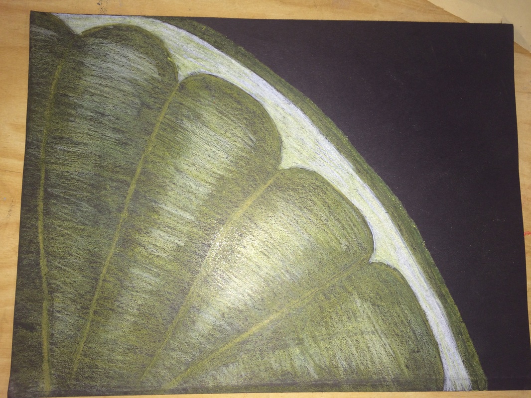
For this project, we had to do a close up of an object. We could use any 3 medias which were: chalk pastel, color pencil, and/or oil pastel. I used 3 shades of yellow prisma color pencil and a white for highlighting certain areas. I also used a basic black paper to make the lemon pop out more. Originally I was going to do a hand full of color pencils or a peacock feather. When we were doing this project we were also doing a clay food project as well. So since I was running out of time i decided against the color pencils because it would take too much time. I also decided against the peacock feathers because 3 other people in the classroom were doing that too. For the lemon I didn't work on it in class, I did it at home so i had no peer review/help. My sister's though told me it was good.
So, for this project it was very simple. I sketched the lemon on the upper right hand corner in pencils, then I colored in the circle with a white for the base. Then I kept layering yellows on top. I made the lines inside the lemon a darker yellow to show value and for the peel i did a dark yellow also. Finally I went back in with the white and highlighted parts of the lemon to look realistic.
The only thing I would change about my project is I would spend more time on it because I spent about and hour doing it and thats all. I would go back in with another yellow and just keep layering and layering to give it more affect. I am surprised it turned out well and doesn't looked that rushed. When I went to class the next day to do our "Feel Good Friday" my friends were impressed and liked the Lemon a lot. They agreed the black paper makes the yellow pop. The thing I learned from this project is that layering color pencils and pressing harder every time makes the art work look better than starting off really dark. I also learned that highlighting and shading makes the project way better.
 RSS Feed