The peppermint was the 2/3 practice with different media. The peppermint was done with chalk pastel. I really DO NOT care for chalk pastel. It is messy and very annoying. I had never used it before but it will go everywhere if you put too much. We practice drawing the peppermint first with pencil to practice shading and giving great amount of detail. We only had a day to do this project. But when using chalk pastel you have to layer light to dark. Plus you have to be careful when coloring to not smug the art work. My artwork got smudge because I lifted it up to shake it off and I layered way too much. I will probably never use this media ever again because it take great patience... Something I do not have. Everyone at my table had struggled with this project so I wasn't alone. It was neat to learn something during art. It looked really fun when my art teacher was doing it. If I could change anything about the project is to make the peppermint bigger on the paper. 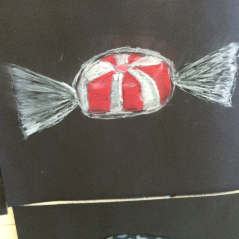
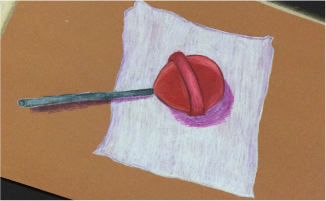 This Dum-Dum Lollipop was 1-3 practices with media that most of the class haven't used before. This artwork was done using Prismacolor pencil. We practiced doing realistic/ proportions. My art teacher gave us all a lollipop to draw we had two days to complete the drawing. Since we didn't have much time this art work is definitely not my best work. I would make the the lollipop look more realistic by shading and highlighting it more. And I would probably make the wrapper more crinkly. I am proud about the shading underneath the lollipop stick. It make the stick look 3D. Out of the 3 practices with media this is by far my favorite. It was cleaner and easier to deal with. The problem I had with this project is that I worried about wax build up because Prisma colors are more waxier than regular Crayola crayons. Since I was afraid of the wax build up, it was hard for me to go darker to get a bolder look. Since everyone at my table are good friends we always give each other good feedback on our work and give advice. Usually I listen to their advice and the project looks better. 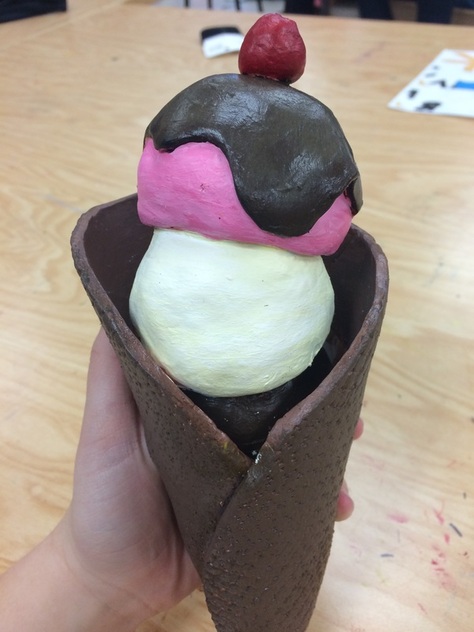 For this project, we were suppose to create food out of clay. Each table in class got a different type of food: breakfast, lunch, dinner, and desert, my table got desert. I was debating what kind of desert to make but i decided to go with a simple ice cream cone. However, the process in making the ice cream cone was quite hard. I started off with the # scoops of ice cream. Those were simple to make. Then i made the hot fudge. Next the cherry ( which had a stem but we lost when firing). And Lastly the cone. After the clay dried and was fired up we began painting. That was absolute pain. I wanted to make the scoops of ice cream classic flavors; vanilla, chocolate, and strawberry. painting the actual cone itself was difficult because I had to make my own brown. Mixing colors is not my best talent. The brown kept being too light or too dark. So the cone has many shades of brown. Oddly enough my favorite part of the whole project is the cone. The detail and texture I think I did very well. If you hold it in your hands it feels like a real cone. My inspiration for this project was that the night before we got the rubric, I had ice cream for desert and I thought it would've been a simpler, but unique thing to do. The art work has no real deep meaning it just shows my creativity and clay skills. The few things I would change about my art work is I would lighten the cone and make the cone a bit smaller. During mostly the painting I would stress about how it looks to my friends at my art table. One day we all exchanged art projects and they to stressed about the color brown on the cone. I always stopped to analyze my project. The overall effect of my peers and my clay skills created a ,what I think, turned out as a great project.
|
ArchivesJanuary 2015 Categories |
 RSS Feed